When my friend told me she was going independent with her gymnastics coaching and said, “I’m coming to you because you’re creative and I trust you,” my brain turned into a firework show.
Woman supporting woman? Say less. I was in.
This wasn’t just a logo.It needed to feel like her: elegant, collected, professional- but still playful enough for kids and teens. I work visually (sorry to my old design teachers who wanted neat sketchbooks).
I see it finished in my head first. Then I reverse-engineer it.
Step 1: How I Work
I don’t really do sketches- which is something I struggled with back in graphic design school. My teachers were always telling me I had to do sketches, but I was just staring out the window, visualising things in my head.
Now that I’m doing it myself, there’s no one to stop me or put me into a “you must do it this way” box. I can finally be completely free, and that’s how I work- I visualise first. I see things in my head as if they already exist. So I started playing with different ideas.
I was thinking:
Should it feel more playful since it’s for children, but still elegant and professional?
And because my friend trains both little kids and teens, I wanted the logo to express who she is-elegant, professional, collected- but still fun and energetic.
- Do I twist the word?
- Do I play with the name?
- Will I use a picture or a figure?
- Will I play with the letters or with the movement itself?
Step 2: First Visualisations
When I came home, I started to research gymnastics — watching videos of gymnasts, seeing how they move, what they use, how it looks.

Designing the “Flip Motion” Logo: Case study
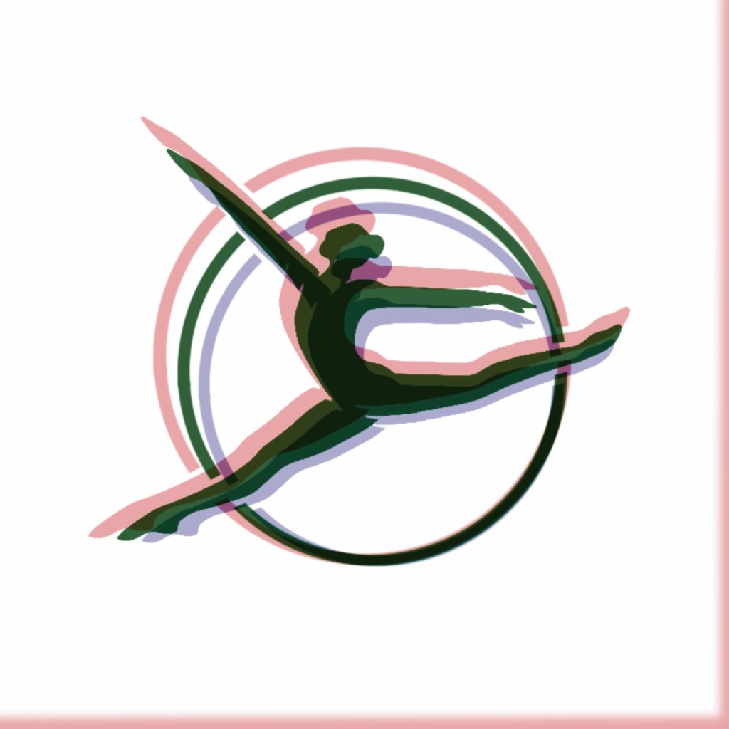
In the videos, I noticed people using a big circle or hoop, and they were doing all kinds of beautiful moves inside it. It looked so elegant and balanced. That was the moment I knew- this is what I want to do.
I showed it to my friend, and she loved it too. We agreed: this was the direction we wanted.
Then I started to visualise again- how it could look, what I could do with it, how to make it move and feel alive.
I explored proportions and line weight so the figure didn’t become clip-arty. The goal:
- Readable at small sizes (IG icon, merch tag)
- Elegant at large sizes (posters, signage)
- Circle weight in harmony with the typography stroke
When the pose clicked, I locked the vector and moved to type.
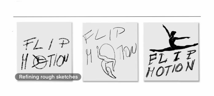
Step 3: Sketches and Early Versions
I started putting it on paper- several rough sketches of what I thought might work best- and sent them to my friend. We picked the one that felt right, and that’s when the real work started.
Then I began to draw it properly- refine the figure, balance the proportions, and then came the hardest part: finding the right font.
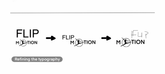
Step 4: The Font Battle
Finding the right font for a logo is always the most painful part for me. I went through multiple fonts, testing and trying different combinations- uppercase, lowercase, playful, minimal- to see what worked.
At first, I had everything in capitals, but the word “FLIP” was overpowering everything else. The main focus should be the gymnast figure, not the word itself.
So I started analysing:
- Why is it overpowering?
- Is it the capital letters?
- The size?
And I noticed that it was taking attention away from the main motif. So I tried multiple options- different letter cases, alignments, and placements.
Then came another issue: when I put it into a square layout, the P and N created a huge gap. It looked unbalanced and strange.
So I took it away and started playing around again- should I move it to the left? To the right? Change the case?
I went through a lot of different combinations before finding the one that felt right.
And then came licensing issues – so I had to create my own font that would fit well.
Step 5: The Final Composition
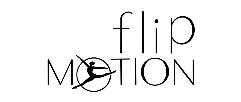
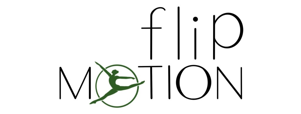
In the end, I decided to keep “flip” in lowercase and “MOTION” in capitals. I shifted the lowercase p slightly upward- something unconventional, but it worked. It balanced the whole composition perfectly.
And yes, when combined, it accidentally created the word “fliption”- which wasn’t intentional, but it actually looked fun. It worked visually, and sometimes little mistakes like that make the design more alive.
The final result was something playful, balanced, and light- with the gymnast in the circle at the heart of it, representing motion, focus, and flow.
Step 6: Choosing the Right Color
My friend wanted a green color, so the next step was to find the perfect shade. That’s never easy.
I tried different versions- what should be green? Should the figure be green? Or maybe the text? How much contrast should it have?
I wanted it to stay soft but still stand out. Eventually, I found the right tone.
Step 7: Final Touches
I created the logo in full color and greyscale, and also made a version that only includes the gymnast symbol- something she can use later for merch, posters, or T-shirts.
It’s small, simple, but strong. It carries her personality- fun, graceful, elegant, and full of motion.
Final Thoughts
It was such a fun process, and I’m honestly happy with the final thing.
I hope it brings her as much happiness as it brought me creating it. Designing something for a person you care about feels different- more emotional, more personal.
You want it to capture them. And I think this one truly does.

Napsat komentář